Design Mistakes That Make Your Kitchen Look Cheap
A beautiful kitchen isn’t defined by price tags or trends—it’s shaped by proportion, thoughtful details, and intentional design. When those elements are overlooked, even a high-dollar remodel can miss the mark.
At Toulmin Kitchen & Bath, we design and build kitchens throughout Tuscaloosa, Birmingham, and the surrounding communities. Over years of experience, we’ve learned that it’s rarely the big splurges that make a kitchen feel elevated—it’s the subtle design decisions you may not notice at first, but feel every day.
Below are some of the most common kitchen design mistakes that quietly make a space look cheap—and how to avoid them when planning a kitchen remodel in Tuscaloosa, AL.

Poor Transitions Between Kitchen & Living Spaces
When a kitchen doesn’t visually connect to the spaces around it, it can feel disjointed—almost like an addition rather than an integral part of the home. This often happens in remodels where the kitchen is updated in isolation, without considering how it relates to adjoining living rooms, dining areas, or hallways. Even a beautifully finished kitchen can feel “off” if it doesn’t flow naturally with the rest of the house.
What makes it look cheap:
A lack of continuity disrupts the home's visual and physical flow, subtly cheapening the overall experience. Mismatched flooring, abrupt ceiling changes, or lighting that feels disconnected from nearby spaces can make the kitchen feel compartmentalized instead of cohesive. These transitions may not stand out immediately, but over time, they create a sense that the remodel wasn’t fully thought through.
Elevated alternative:
An elevated kitchen design looks beyond the kitchen itself and considers how the space connects to the rest of the home. When transitions are thoughtfully planned from the beginning, the kitchen feels cohesive, intentional, and fully integrated—not separate or added on.
Key design elements that support this continuity include:
Coordinated flooring and trim that create seamless transitions between rooms
Consistent ceiling heights and complementary lighting styles throughout adjoining spaces
Intentional sightlines, such as aligning islands, cabinetry, or focal points with nearby living or dining areas
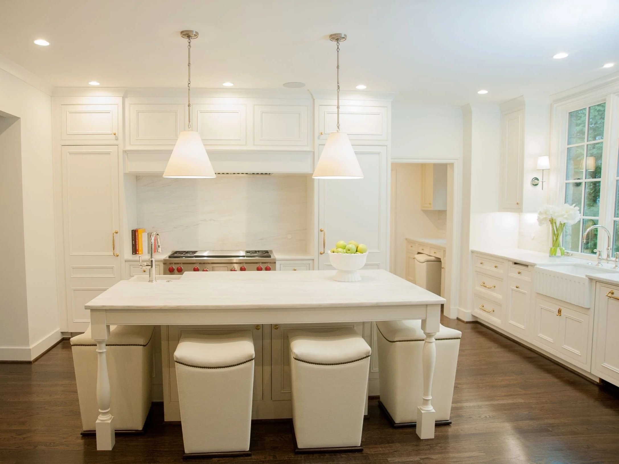
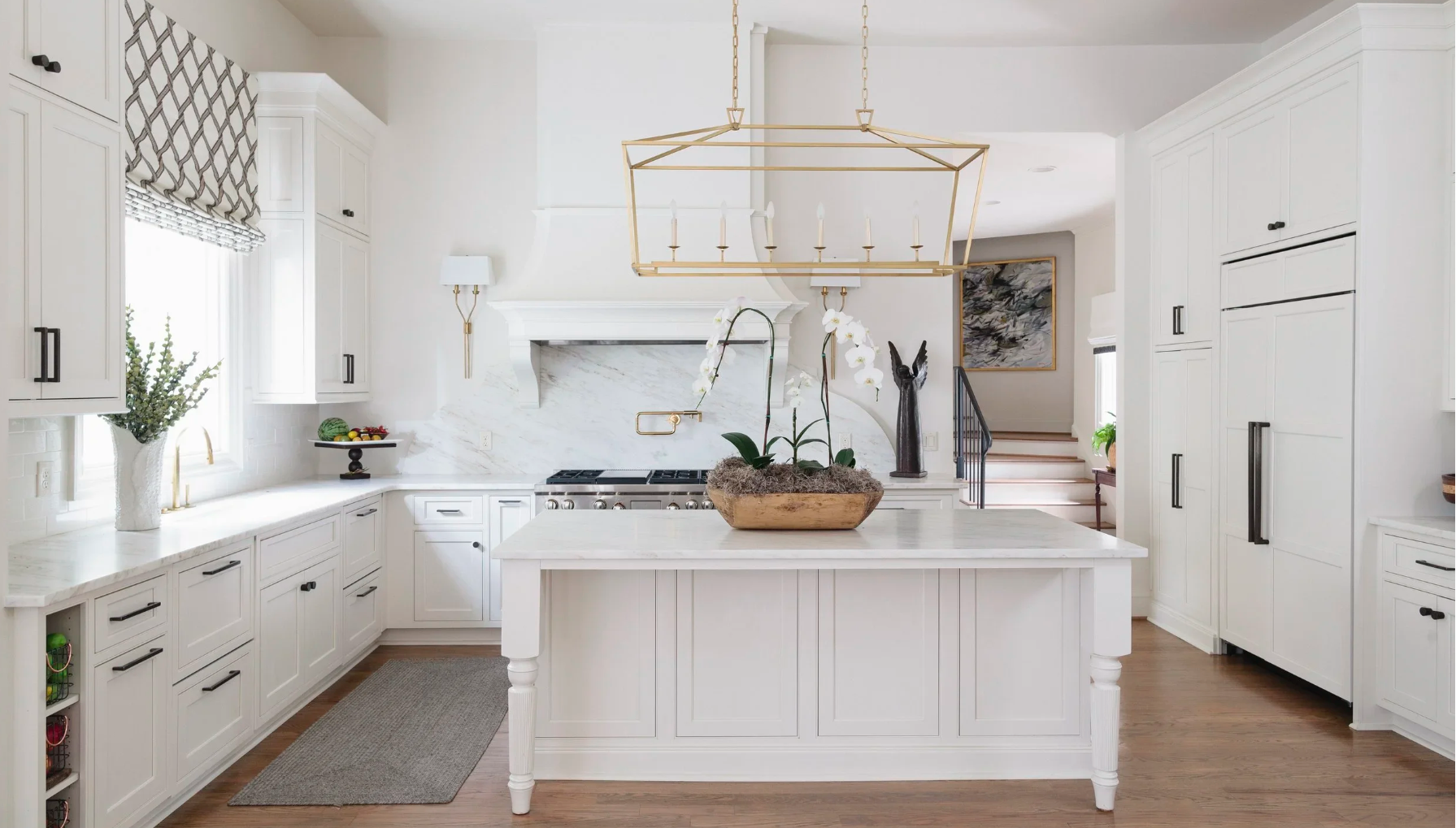
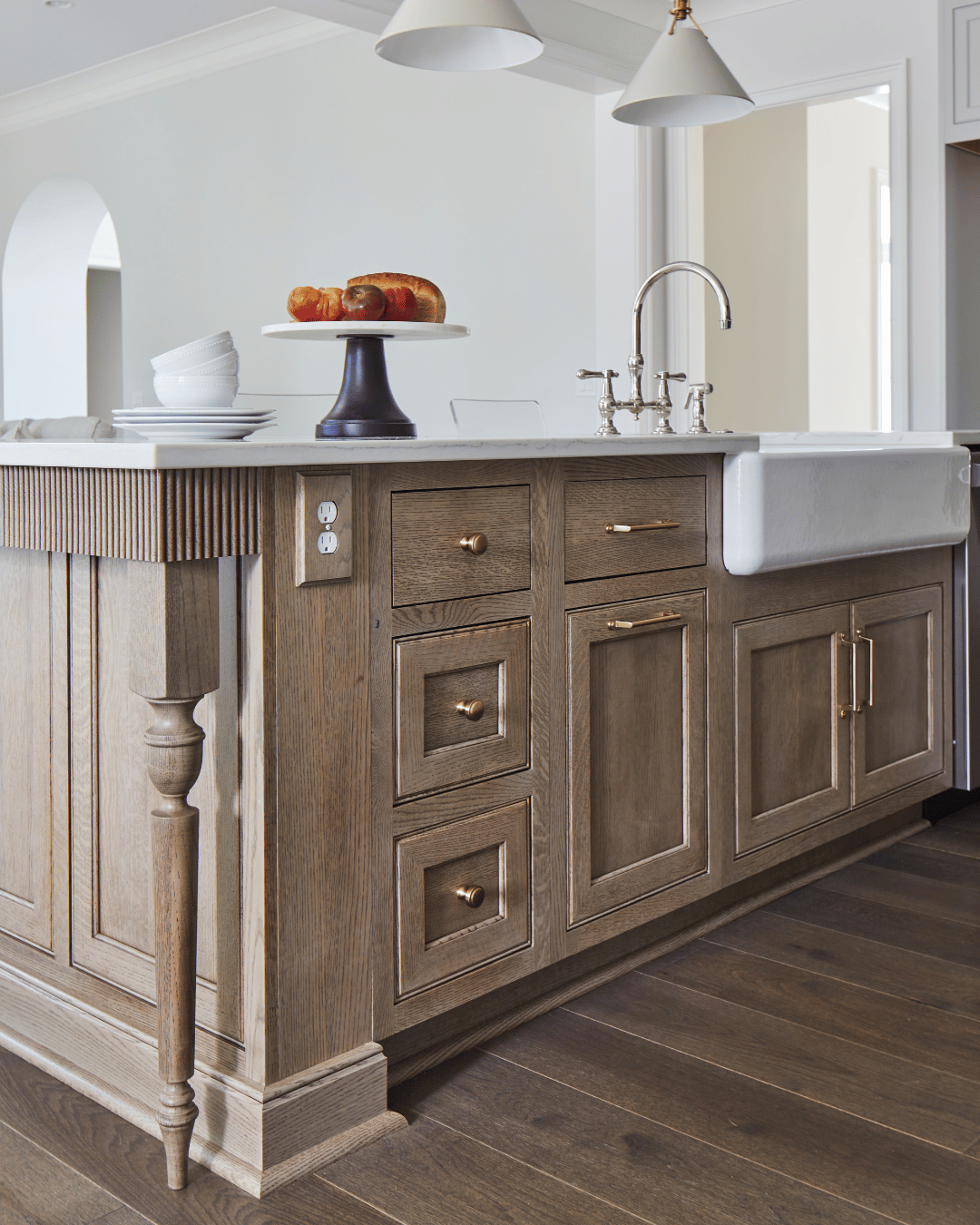
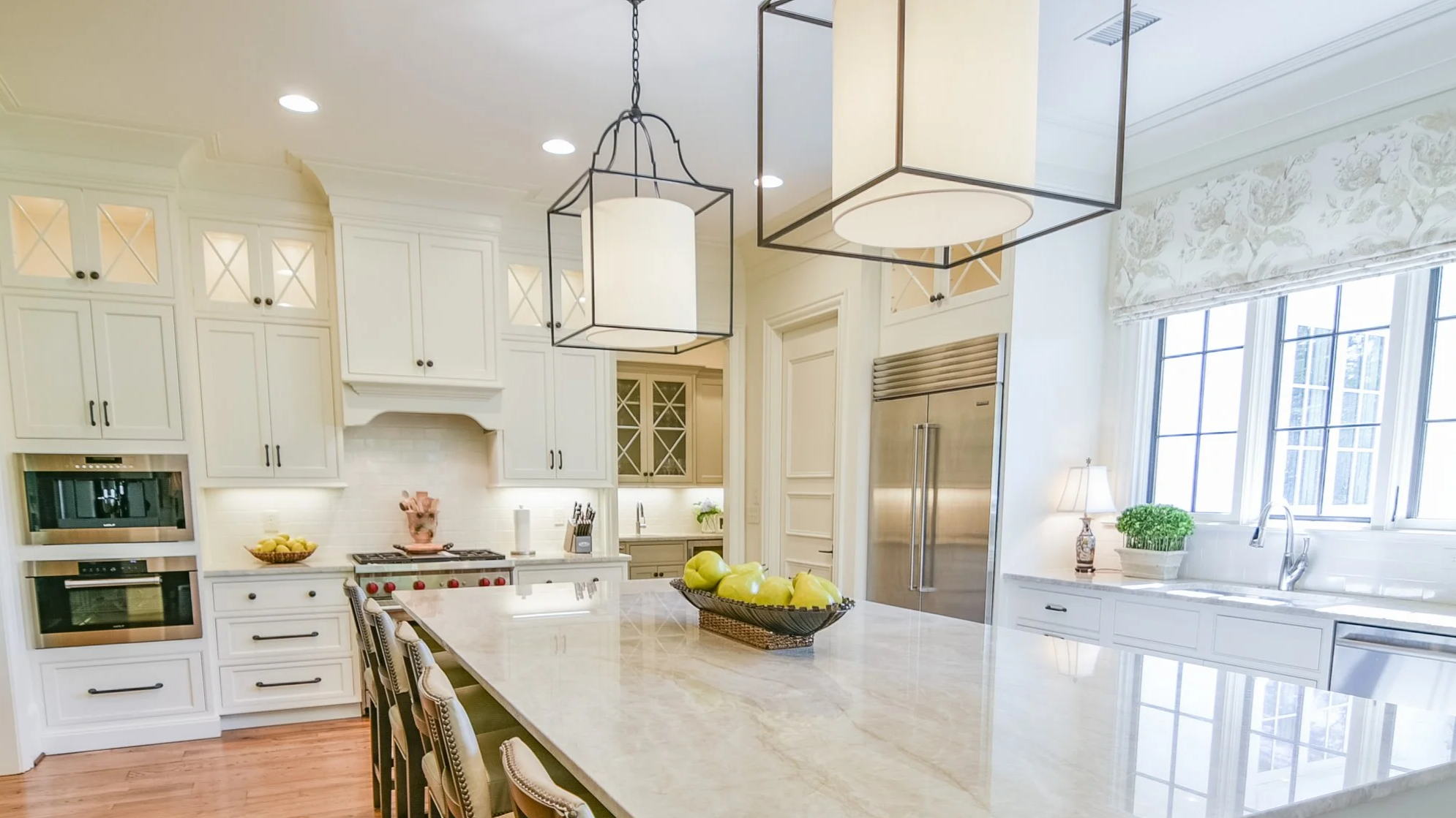
Playing It Too Safe With an All-White Kitchen
All-white kitchens remain popular for good reason—they’re clean, bright, and can feel effortlessly classic. But when white is used as a default rather than a design choice, the result can feel flat, predictable, and uninspired. Without layers of contrast, texture, or warmth, an all-white kitchen often slips into builder-grade territory, no matter how new the space may be.
Common mistakes include:
These common elements used in all white kitchens can make even a fresh remodel feel dated sooner than expected:
Stark white cabinets paired with flat white quartz
White subway tile everywhere
High-contrast black hardware with no warmth
How to elevate the look:
White kitchens can be timeless, but they require intention. The difference between a refined white kitchen and one that feels generic comes down to subtle details.
Elevate your white kitchen with:
Warm white or soft neutral cabinetry
Countertops with natural veining and movement
Mixed materials like wood accents, plaster or metal hoods, or honed stone
Add a pop of color to your kitchen island

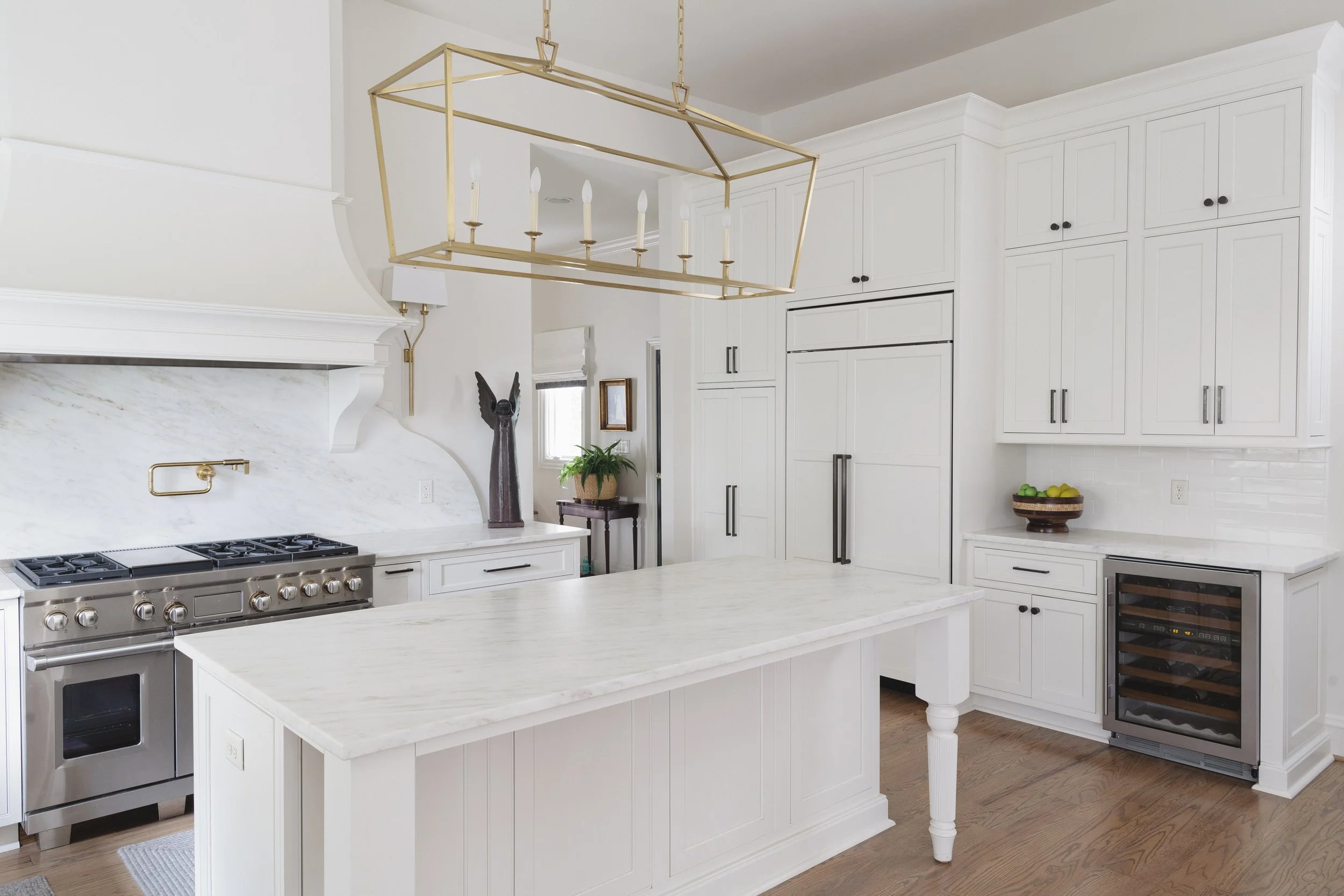
Choosing Overlay Cabinets Where Custom Matters Most
Cabinetry plays a massive role in how refined a kitchen feels. While full-overlay cabinets can offer upfront cost savings, they often introduce shadow lines and visible gaps that subtly detract from a truly custom appearance. These details may seem minor, but in a kitchen—where cabinetry dominates the visual landscape—they can make the space feel more mass-produced than thoughtfully designed.
A common cabinetry mistake:
Using overlay cabinetry in the main kitchen and wondering why it doesn’t feel “high-end.” The result is often a kitchen that looks fine at first glance but lacks the depth, craftsmanship, and architectural presence associated with custom design.
Our recommendation:
Invest in inset or flush-inset cabinetry for the kitchen
Run cabinets all the way to the ceiling
Save overlay cabinetry for secondary spaces like laundry rooms or pantries
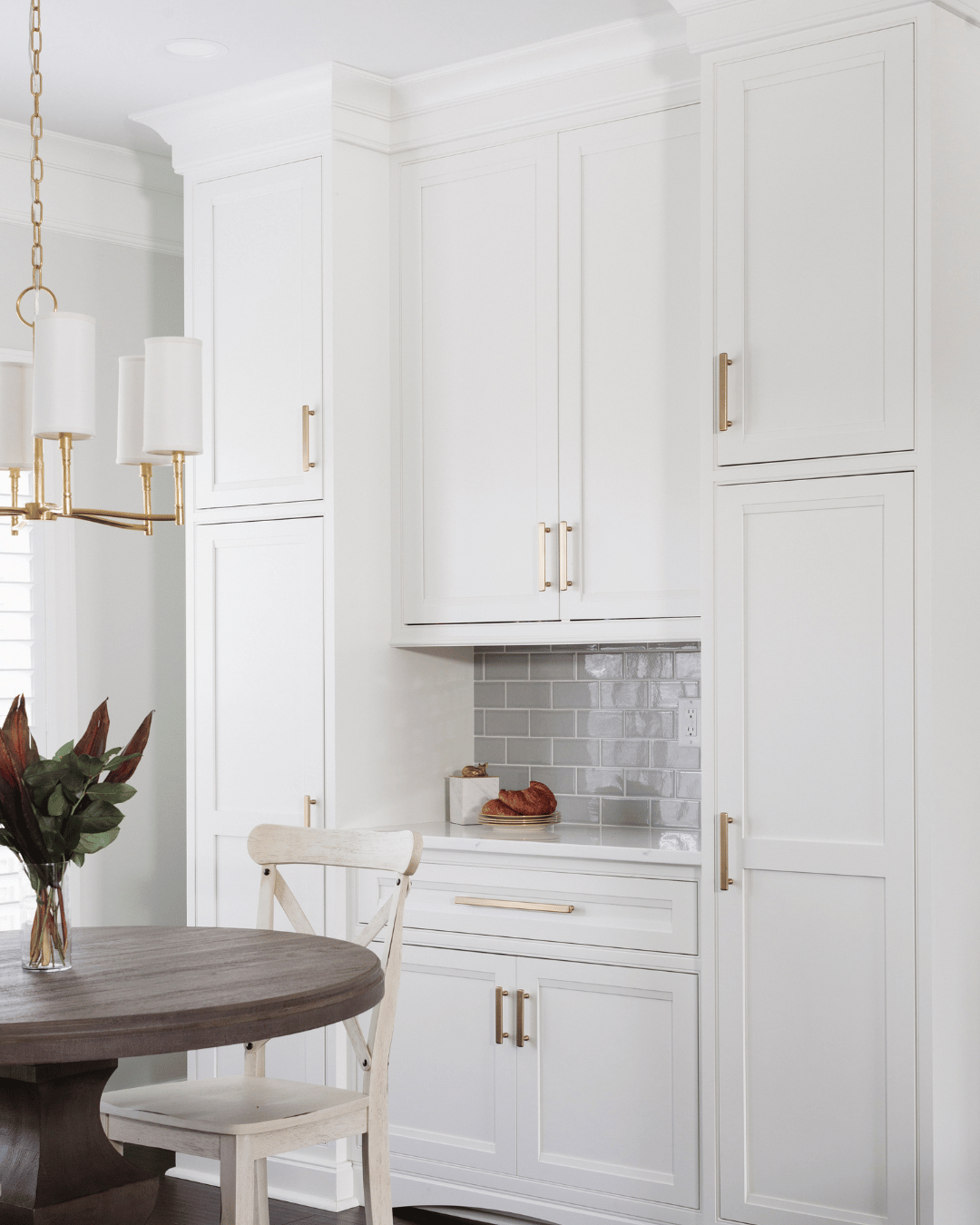
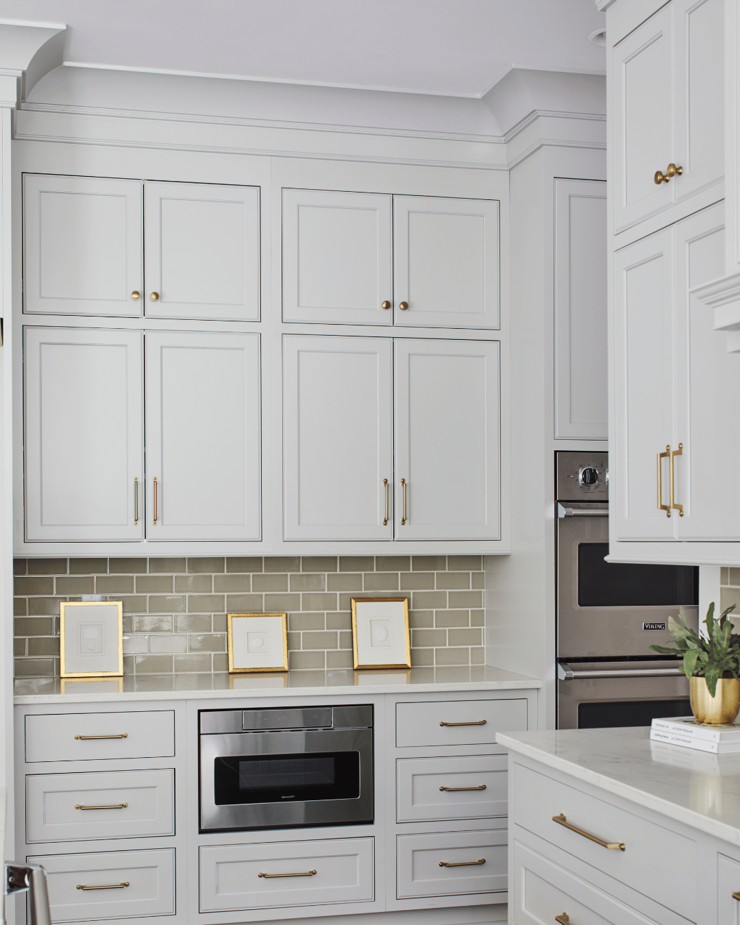
Stopping Upper Cabinets Short of the Ceiling
Upper cabinets that stop short of the ceiling create awkward negative space that’s difficult to style and even harder to ignore. That empty strip above the cabinets often becomes a visual dust collector—literally and figuratively—and it immediately signals builder-grade construction rather than thoughtful, custom design. Instead of feeling intentional, the space looks unfinished, as if something was left out of the plan.
Why this matters:
Cabinets to the ceiling visually heighten the room
They offer more storage
They add architectural presence
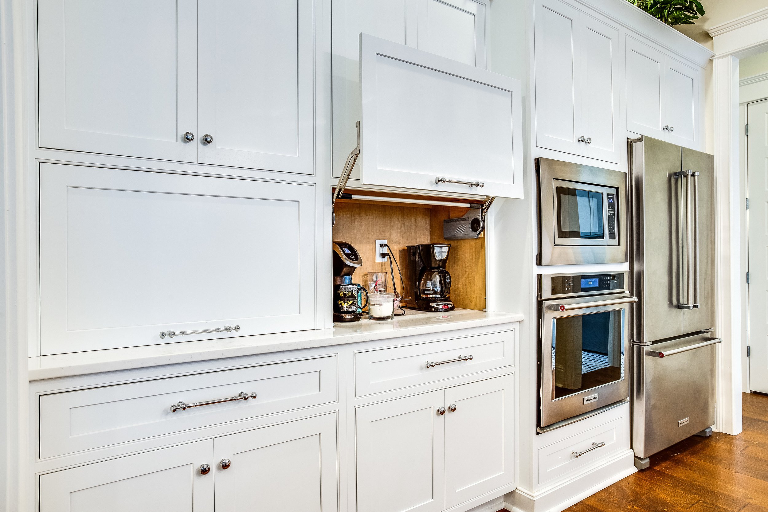
Ignoring Cabinet Interior Function
A kitchen can look beautiful at first glance, but feel cheap in daily use when drawers and cabinets aren’t thoughtfully planned. This is where true design-build expertise makes a difference. A kitchen shouldn’t just look good on reveal day—it should function effortlessly for years to come. Thoughtful interior planning ensures that every cabinet and drawer is designed around how you cook, entertain, and live. When storage is customized from the start—rather than treated as an afterthought—the kitchen feels intuitive, efficient, and well considered, rather than generic.
Elevated and functional options:
At a design-build firm like Toulmin Kitchen & Bath, cabinetry layouts and interior functionality are planned alongside the overall design, not added later. That means fewer wasted inches, smarter drawer configurations, and storage solutions that quietly support your daily routines. It’s a level of planning that homeowners may not notice immediately—but it’s exactly what separates a kitchen that feels truly custom from one that merely looks finished.
Custom drawer configurations
Built-in utensil, spice, and pan storage
Purpose-driven cabinet interiors
Appliance garage cabinets
Flat, Builder-Grade Trim and Moldings
Skipping crown molding, light rails, or custom trim details can make even high-quality cabinetry feel unfinished. These elements may seem minor in the scope of a full kitchen remodel, but they play a critical role in giving cabinetry its architectural weight. Without them, cabinets can appear flat or boxy—more like furniture placed in a room than built-in elements designed specifically for the space.
Why trim details matter:
Crown molding helps cabinetry transition gracefully to the ceiling, creating a polished, intentional endpoint rather than an abrupt stop. Light rails conceal under-cabinet lighting while adding visual depth and a finished edge to upper cabinets. Other details—such as furniture-style bases, decorative end panels, or subtle reveals quietly elevate the entire kitchen by reinforcing the idea that the space was carefully designed, not assembled from standard parts.
Elevated alternatives:
In custom kitchen design, trim is what ties everything together. It’s the difference between cabinetry that simply fills a wall and cabinetry that feels fully integrated into the architecture of the home.
Details like these are what transform cabinetry from standard to custom:
Cabinet crown to the ceiling
Furniture-style base details
Integrated light rails

Using Cheap or Painted Cabinet Hardware
Cabinet hardware may be small, but it carries an outsized impact. Choosing the right hardware is one of the easiest ways to elevate a kitchen without increasing square footage or changing the layout. That said, painted hardware finishes—especially matte black or faux gold—have the opposite effect. They tend to chip, wear poorly, and cheapen the look over time.
What we recommend instead:
Living finishes like unlacquered brass
Polished or satin nickel
Solid metal hardware with weight and longevity
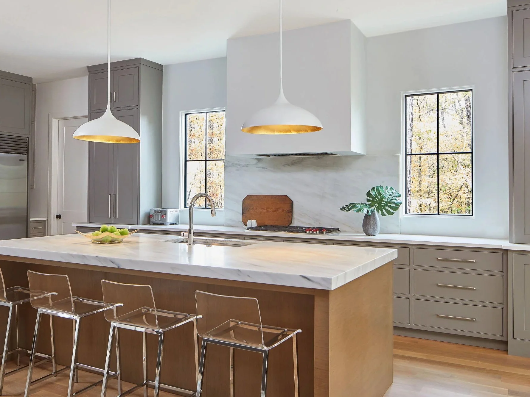
Relying Only on Recessed Lighting in Your Kitchen
One of the fastest ways to flatten a kitchen design is to rely solely on recessed ceiling lights. While recessed lighting has its place, a grid of can lights alone can make even a brand-new kitchen feel sterile and unfinished.
What works better:
Layered lighting adds depth, warmth, and a truly custom feel—an approach we prioritize in every Tuscaloosa kitchen remodel.
A well-designed lighting plan typically includes:
Decorative pendants over the island
Wall sconces near open shelving or windows
Under-cabinet lighting for both function and ambiance
Dimmers to easily adjust the mood throughout the day
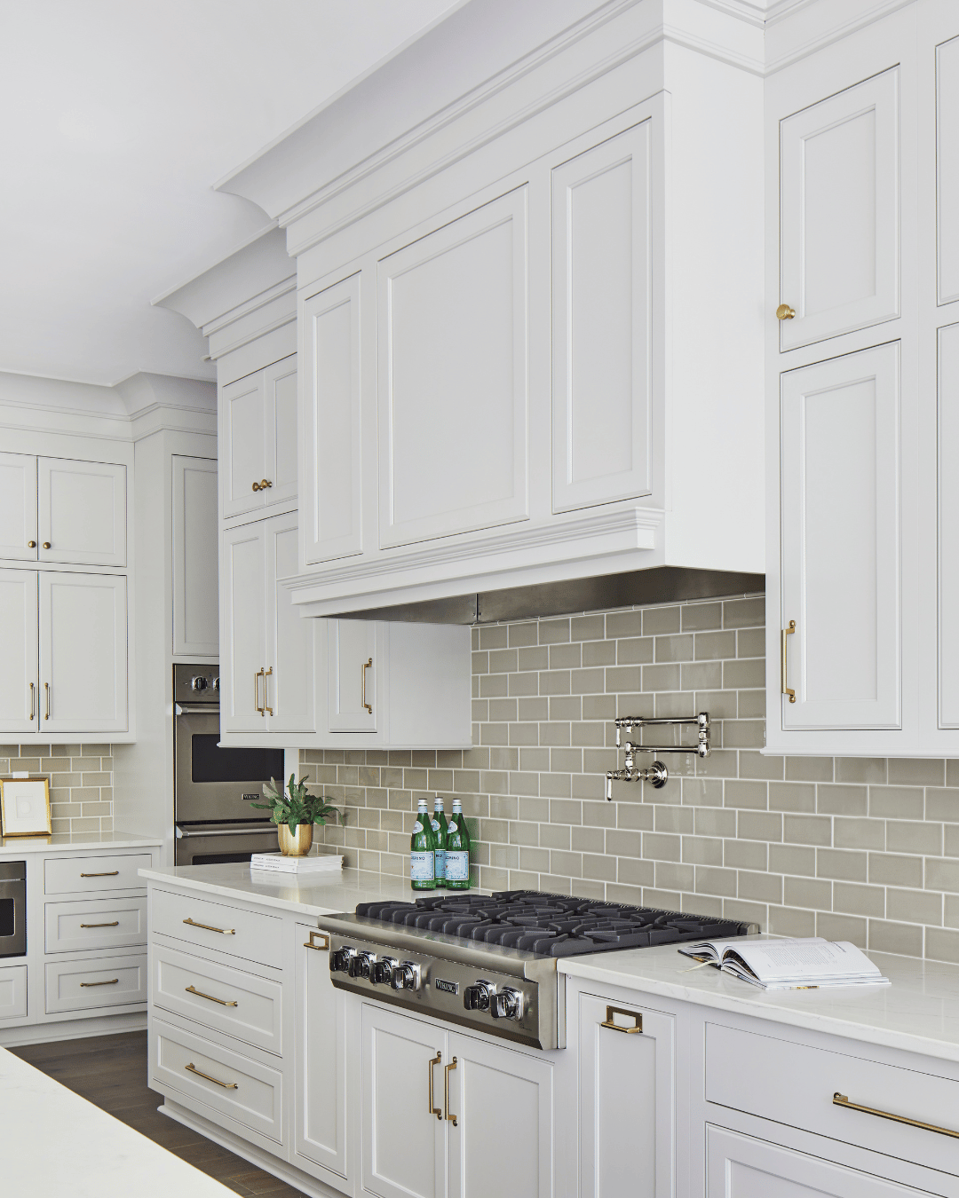
Poor Backsplash Scale or Cheap Tile Choices
Using small, repetitive tile with heavy grout lines—especially glossy white subway tile paired with bright white grout—can instantly date a kitchen and make it feel mass-produced. While this look was once considered a safe, timeless choice, it has become so widely used that it now reads as builder-grade when applied without variation or intention. The abundance of grout lines creates visual clutter, pulling attention away from other design elements and making the space feel busier and less refined.
Why it looks cheap:
Too many grout lines create visual noise and give the impression of mass production.
Elevated backsplash alternatives:
A more elevated approach focuses on scale, texture, and continuity. Larger-format tile reduces grout lines and creates a cleaner, more streamlined look. Full-height backsplashes—especially those made from natural stone or slab materials—add depth and visual interest while making the backsplash feel like an architectural feature rather than an afterthought. Even when tile is used, softer grout tones, handmade finishes, or subtle variations in texture can make a significant difference. The goal is for the backsplash to support the overall design, not dominate it—or quietly date it a few years down the road.
To create a high-end, custom look, consider these options:
Larger-format tile
Full-height stone or slab backsplashes that extend to the ceiling
Handmade or textured tile with softer grout tones
Slab stone or tile used as a statement feature
Curved edges, arched transitions, or softly contoured detailing that add architectural interest
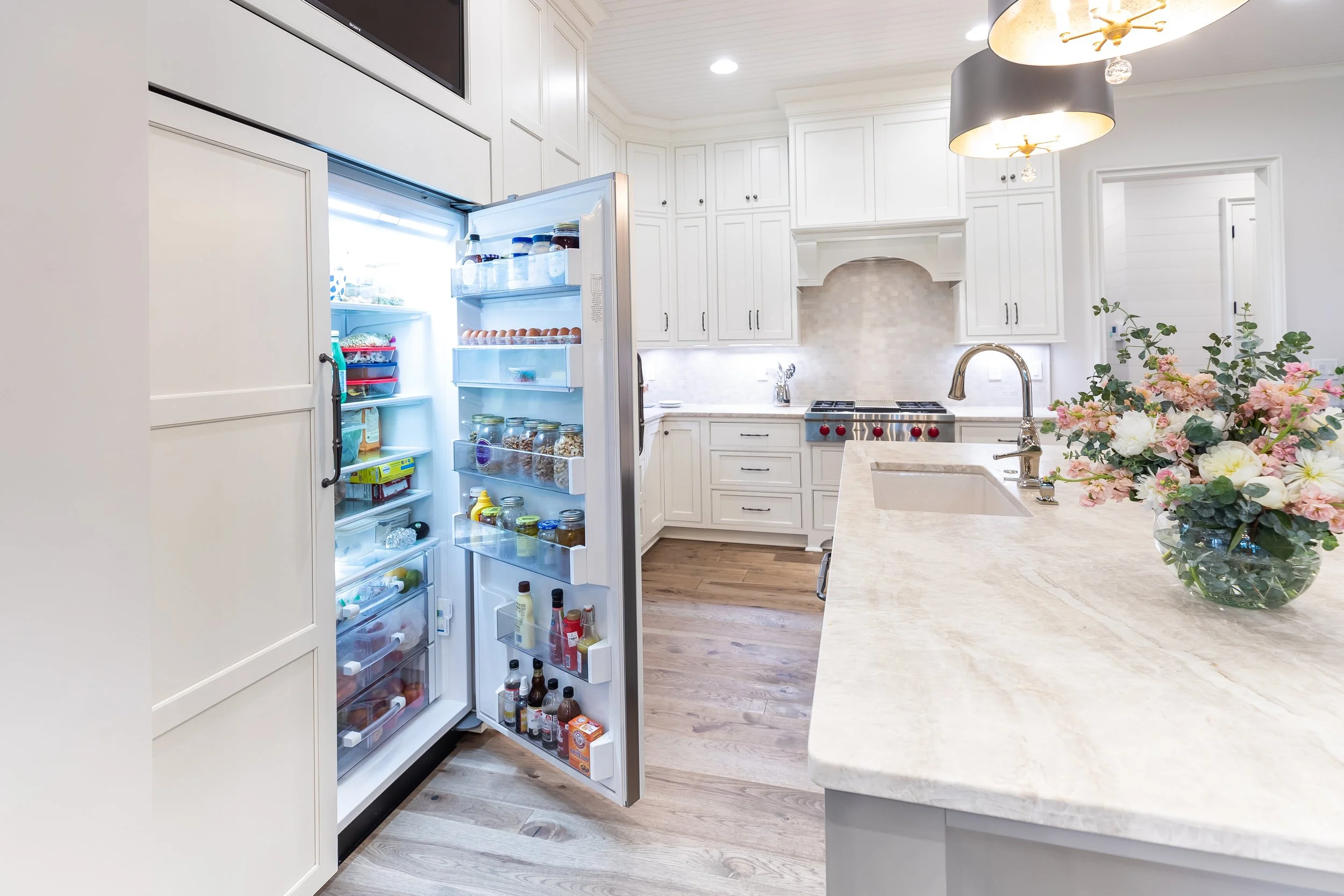
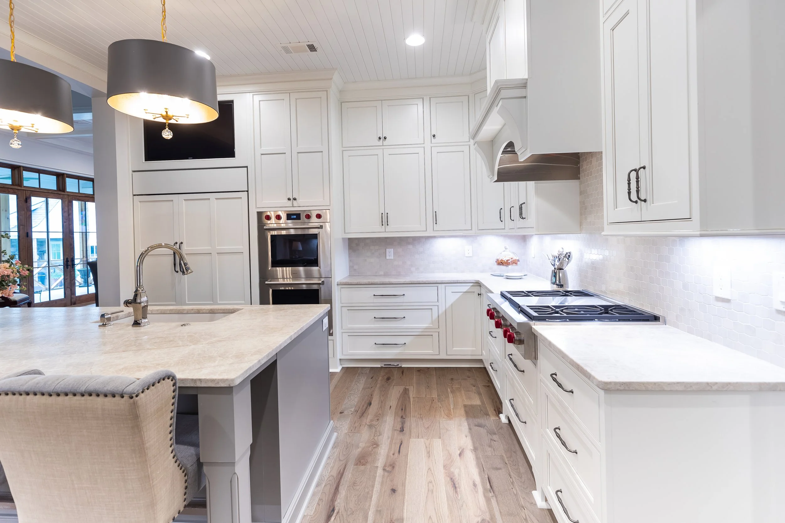
Poorly Sized or Exposed Appliances
Nothing disrupts a kitchen’s flow faster than appliances that don’t fit properly. Even in a well-finished space, appliances that feel oversized, undersized, or awkwardly placed can break sightlines and make the kitchen feel cluttered or unfinished. These issues often stem from selecting appliances after the cabinetry has been designed—or choosing standard sizes that don’t align with the overall layout.
Common issues include:
Refrigerators that protrude beyond surrounding cabinetry, interrupting clean lines
Visible gaps around ranges, dishwashers, or wall ovens that signal a lack of customization
Microwaves left on countertops, competing for space and visual attention
A better approach:
Panel-ready or integrated appliances, when possible, to blend seamlessly with cabinetry
Built-in appliance garages or pantry cabinets to keep small appliances out of sight
Custom cabinetry designed around exact appliance specifications, not the other way around

Choosing a Prefabricated or Undersized Kitchen Island
The island is often the visual and functional centerpiece of the kitchen—yet it’s also one of the most common missed opportunities in a remodel. A poorly sized or prefabricated island can feel like an afterthought, interrupting traffic flow and diminishing the impact of an otherwise well-designed space. Because the island is so central, any imbalance in scale or proportion is immediately noticeable.
Prefabricated islands are often:
Too small for the space, making the kitchen feel underutilized or awkward
Poorly proportioned, with incorrect heights, overhangs, or depths
Disconnected from the rest of the design, both visually and functionally
What works better:
A custom island scaled specifically to your kitchen’s layout and circulation needs
Furniture-style details or waterfall edges that give the island weight and presence
Thoughtful planning for seating, storage, and clear walkways around the island
A well-designed island should anchor the room—not compete with it or feel tacked on. And yes—peninsulas still tend to date a kitchen faster than almost anything else, often restricting flow and signaling an outdated layout. When designed intentionally, the island becomes a true focal point that elevates the entire kitchen.
Need a Kitchen Designer in Tuscaloosa?
When you work with Toulmin Kitchen & Bath, you gain a partner who helps you avoid common remodeling pitfalls. Let’s design a kitchen that works beautifully for your home.
Ready to Design a Kitchen That Truly Feels Custom?
You can avoid these common design mistakes by working alongside an experienced kitchen designer who understands how every detail works together. At Toulmin Kitchen & Bath, we guide you through the entire design-build process—helping you make informed decisions that result in a kitchen that feels intentional, functional, and beautifully finished.
Call us at (205) 579-8392 or book a free consultation online.
More Design Ideas You’ll Love